The Rule of Threes
How you merchandise your space has a huge impact on shopper engagement. The Rule of Threes is a tried and true concept across retail merchandising and interior design that could teach you to arrange your products in an exciting new way!
The Rule of Threes says that arranging objects in groups of three creates a balance that naturally draws the eye. Odd numbers in general can force the eye to move from piece to piece, creating an engaging visual experience. We’ve outlined three (😎) examples of this strategy at work in vendors spaces!
1
Keep it Cohesive.
By layering three similar tables with different heights and widths, the vendor maintained a consistent aesthetic but added interest and movement to a display that may otherwise have felt stale.
2
Mix It Up!
On the other hand, adding variety to the three items in your vignette can cause each to gain equal attention from your shopper, while still keeping their eye moving around the space.
3
Make it Simple.
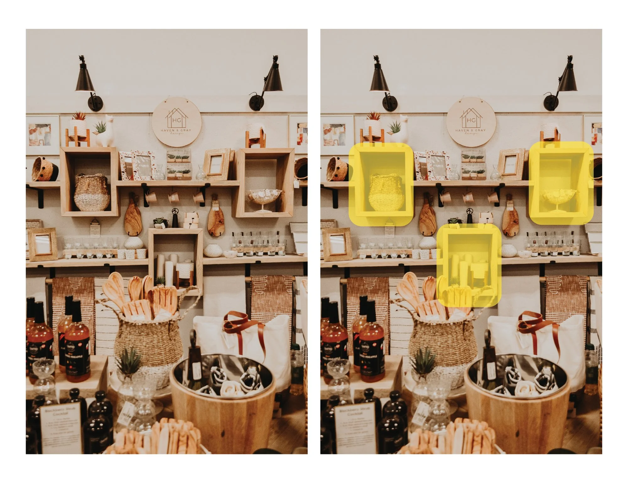
While you can always arrange your existing merchandise into odd groupings, consider adding a permanent display fixture to your space that has the rule of threes built in! They way the shelves in the example are designed will allow the vendor to consistently swap out pieces and easily maintain the effect without high effort.
There’s no rulebook when it comes to designing your space, but we hope this strategy inspires you to flex your creative muscles next time you refresh your inventory!


